


Our laconic spirit is reflected in the design of our clothes and the spaces we create. We love the simplicity of form and functionality, and the ethical values we encase around our brand – following this, we wish to build a realm where each corner is reflective of our whims.
CAPSULE PRODUCT
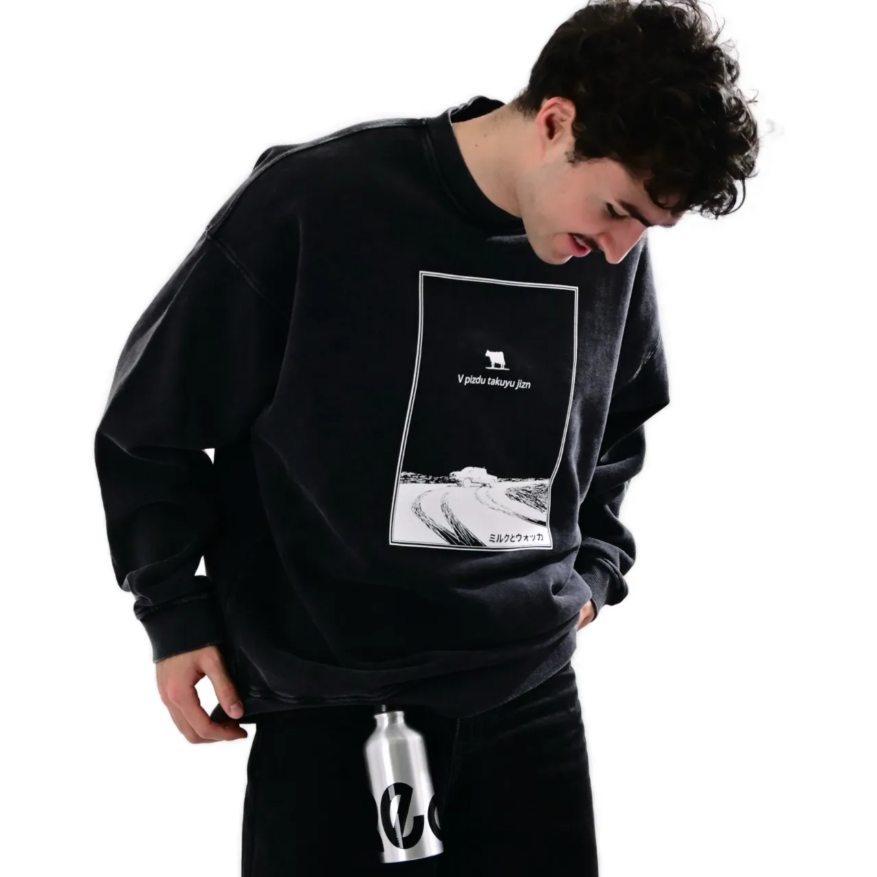
The basic principles of our brand's designs are determined by our love for efficiency and expression. Design is important to us – form and function, expression and individuality. Every T-shirt must have a wow-factor - in that our customers feel they have introduced into their wardrobe an item of value. We keep things simple. Our base collections continue by being reinvented after each design set sells through. And we use different print techniques that compliment the current season.
Every object must have an elegant reason for being. To partner with the base collection, we look for objects and accessories that not only have clean, minimalistic forms, but also details that levitate from the usual. For example a steel thermos with a soft-touch coating, etched with our popular text. And their ecology - BPA Free - which echoes our passion for the future.

CREATURE OF SOCIETY - first sweatshirt with 3D rubber text.
PRINTING TECHNIQUE
We seek out printing methods that give more power to our images. And we choose the silkscreen method of printing because it fits with our prerequisites of quality and longevity.
We are very fond of voluminous soft-touch 3D effects - especially for lettering and fonts. Our image THINK is rendered in reflective hologram, catching car lights where ever the wearer travels. The minimalist concerns of our FL X capsule series is created with an interesting 3D rubber brick. Roland Bruekners famous KURT image and HATTOMONKEY's HELL image are discharge printed – a technique that subtracts the colour from the T-shirt, and replaces it with another.
In 2022 we found our confidence with multi-media techniques. Beautiful hand-embroidered details accent images from NIKITA KAUN and ABNORMALOS. And varying 3D effects highlight a traditionally printed BOJEMOI image.

TO HELL WITH IT by HATTOMONKEY - discharge print with colour replacement, and fluro splatters finished by hand.
INTERIORS
All FREELABEL and DELONATELO interiors are united by the same concept – be elegantly unique. We look to moments of inspiration, a single cue, when we create our spaces. Our FREELABEL store in the Bottlehouse was inspired by Alexey Poplavsky's black-white sketch and checkerboard pattern.
The FREELABEL Moscow showroom was prompted by the red walls that greeted us when we first took the space. Downstairs “Chinese Laundry” for the industrial style of the ceiling and many electrical cables. The second floor labeled “Opium Smoking Room” - is reminiscent of the famous back-street upstairs rooms in the historic China Towns of the early 20th Century.
They all share a certain approach to space - we strive to fill it with expression and to use recycled elements repurposed into custom furniture. It is important for us to emphasize the individuality of each store. It also shows the versatility of our product in different surroundings, and different neighbourhoods.

FREELABEL MOSCOW - A red interior with hand-painted text, restored furniture, and oriental elements.
INDIVIDULISM
We believe collaboration is the essence of individualism. Pairing ideas and concepts with different minds often leads to immense creativity - particularly when the creativity results in something very unique. Terminal Design group recognised our love of individualism in the form of personal expression, and developd for Freelabel a font that could be used across the whole of our design palette.
The Terminal Design team was inspired by the hand formation of the lettering, from the 1960's/1970's posters of the protest movement and sexual revolution, where each character was drawn by hand. Main inscriptions on posters and placards, did not always fit into the into a limited format, or even in a straight line. In some instances letters are created using adhesive tape.
Each letter was hand drawn and vectorised, and developed into a varable font. For this unique identity, the Terminal Design team won silver in the White Square and ADCR awards - the largest international festivals of creativity in Europe.
READ MORE ABOUT THIS PROJECT AND HOW WE APPLIED

FREELABEL FONT - A unique variable font created specifically for Freelabels text capsules.
THE FUTURE
Our next space will encompass a lot of recycled mirrors. Some people consider mirrors a portal into another world. Sometimes another world is needed. However, we believe escapism has a tangible relationship with functionalism. Fashion as the forefront of escapism, needs to not only be creative, but also functional in order to meet todays standards.
With the success of our MINIMAL TEXT series, we decided to consolidate designs into capsules, released periodically through the year. As we are a trans-seasonal brand, each capsule will enter the assortment as a previous capsule retires. The methodology is to reduce excess, but at the same time allow our followers to experience any innovations and discoveries.
As we expand our thematic capsule collections we will allow for innovative and experimental techniques, in combination with our ethical and sustainable principles.